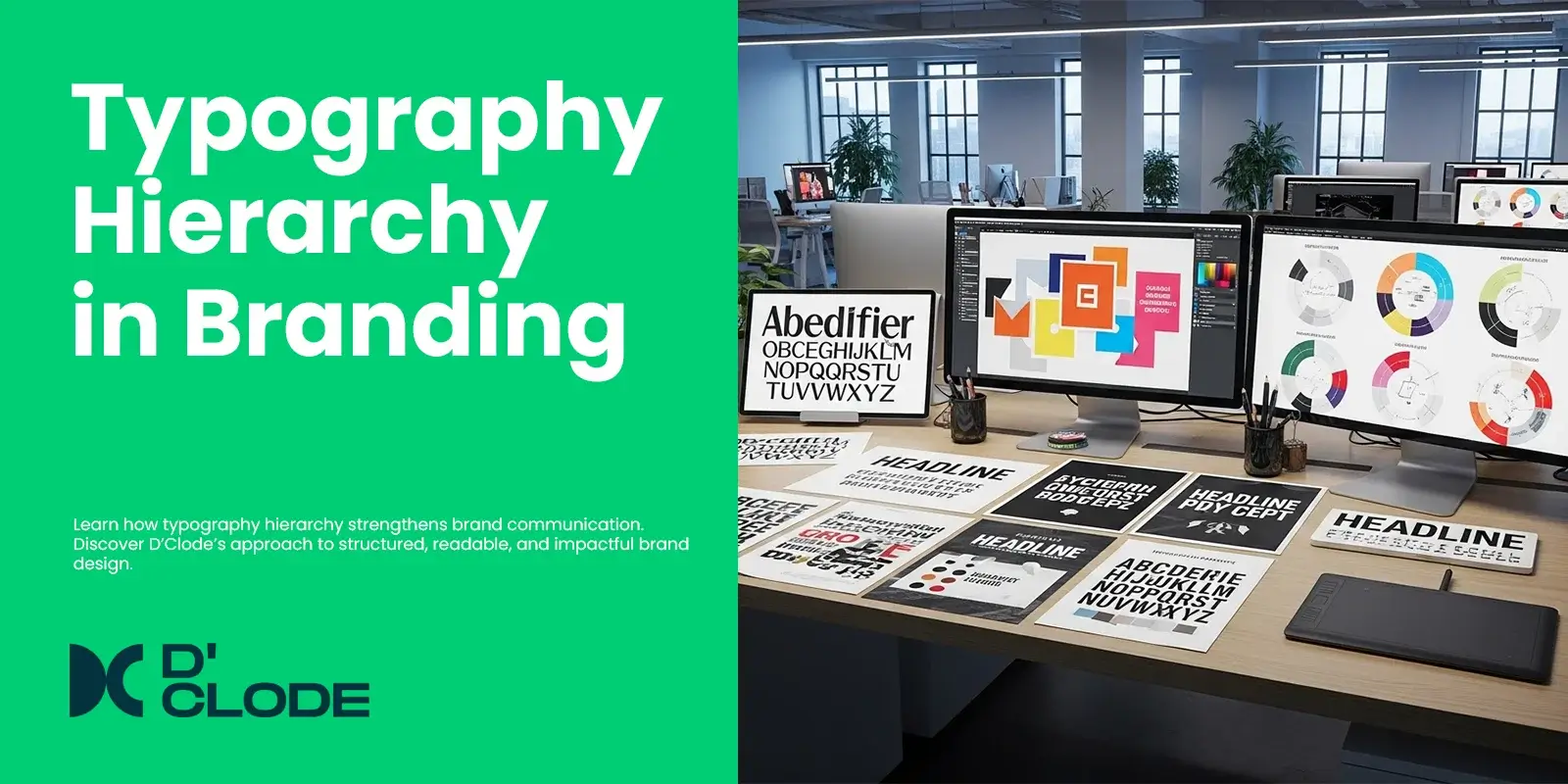
Typography is the foundation of successful brand communication. It is not just about picking pretty fonts. It’s about hierarchy — the system that organizes content into a clear flow, creating visual movement and hierarchy of what’s most important. Great typography hierarchy not only means your brand’s message is read, but read and understood quickly.
In branding and design, hierarchy is simply how you organize text based upon importance using text size, weight, spacing, and color as visual cues to organize text. Headlines engage the audience, subheadings provide context, and body text shares details. This framework of organizing messages assists with the process of information efficiently, and gives credibility and intention to visuals.
At D’Clode, we take typography very seriously, in both an art form and a scientific approach. All projects begin with defining a serious hierarchy – perhaps bold, modern fonts for confidence or elegant faux-serif fonts for trust, or minimalist sans-serif fonts for simplicity. We help align typefaces with your brand personality and ensure consistency across communication platforms which include your website and packaging.
Typography hierarchy is much more than simply providing readability, it builds trust, rhythm, and harmony of visuals. If an audience can read text, typography shares in your design and your messages become emotional.


One Comment
How Does Brand Identity for Startups in Oman Improve Growth? | 5 Ways to Build a Strong Brand Identity in Oman
[…] Typography also plays a significant role in establishing a company’s visual identity. Consistently using a maximum of two typefaces throughout your company’s website, packaging, and social media creates an overall cohesive feeling for customers. Consequently, your customers will recognize your brand’s presence regardless of whether they see it in the digital domain (online) or in the physical domain (offline). […]