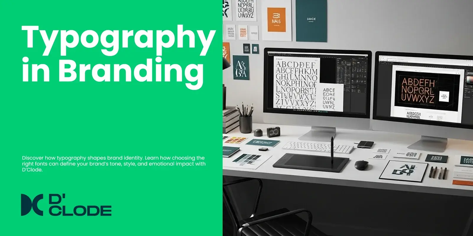
Typography encompasses far more than simply choosing fonts and typefaces; typography is the silent voice that affects the manner in which your brand is perceived. The suitable typeface can convey engagement and personality, build trust, and increase recognition, but the unsuitable typeface may confuse or alienate your audience. Typography is the foundation of your visual identity in branding and design.
Every typeface carries emotion. Serif fonts, such as Times New Roman or Garamond, suggest tradition, reliability, and professionalism, making them suitable for brands based on luxury and corporate. Sans-serif fonts, such as Helvetica or Poppins, are modern and clean, indicating approachability, making it suitable for technology and lifestyle companies. Script fonts are good for conveying elegance and creativity but should not be used excessively to maintain readability.
Typography signifies consistency when developing a brand. Using the same font family from your logo to your website to your packaging to every piece of collateral or marketing material builds the identity of a brand through recognition. It signifies professionalism and reinforces the voice of your brand, whether the brand is bold and confident or calm and minimalist.
At D’Clode, we design brand identities where the typography does the talking. By examining legibility, emotion, and design aesthetics, we create typographic layouts that provide both great aesthetics and the proper feelings. After all, typography is the unspoken storyteller of the brand.

